

Modals have been a staple feature on websites for years, enhancing user experience on both desktop and mobile platforms. Leveraging content stacking and utilizing fetch for various tasks can significantly improve UX. However, many developers are unaware that the HTML and JavaScript specifications include a native modal system through the popover attribute. Let’s delve into this cool feature!
The HTML
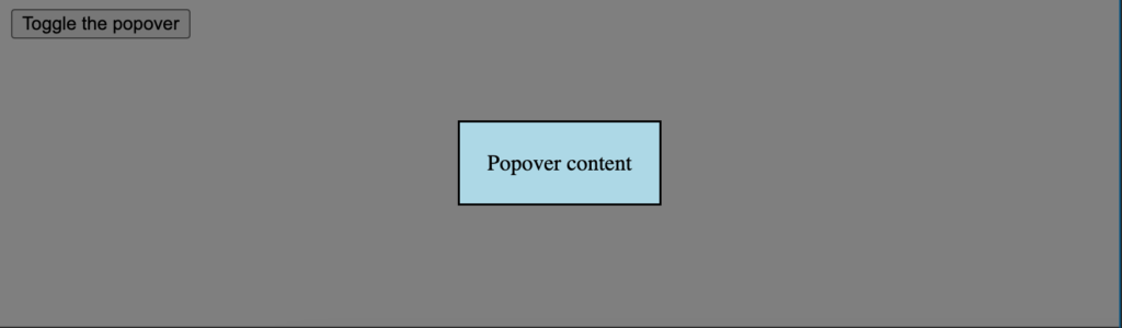
To create a native HTML modal, you simply need to use the popovertarget attribute as the trigger and pair it with the popover attribute, along with an id to identify the content element:
This is the contents of the popover
Upon clicking the button, the popover will open. To style the modal background color, you’ll need to add some CSS magic.
The CSS
Styling the popover content is straightforward, but you can use the browser stylesheet selector’s pseudo-selector to style the modal background:
      /* contents of the popover */
      [popover] {
        background: lightblue;
        padding: 20px;
      }

      /* the dialog's "modal" background */
      [popover]:-internal-popover-in-top-layer::backdrop {
        background: rgba(0, 0, 0, .5);
      }
:-internal-popover-in-top-layer::backdrop defines the modal’s background. Traditionally, this UI element has an opacity to indicate its stacking relationship.
Check out this interactive demo on CodePen: Click here